Category Archives: IT Risk Management

Socializing Internet of Things risk

IoTRisk-g

adding risk from IoT doesn’t mean the existing risk to an organization conveniently disappeared …

There is a lot of conversation regarding security, privacy, safety and other issues regarding the ongoing proliferation of the Internet of Things (IoT). While IoT promises many helpful and useful things, concern about how it might (and will) be misused are valid. However, there are more than a couple of challenges to addressing this new source of risk to an organization.

Lions and Tigers and Bears

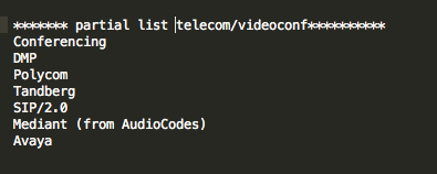
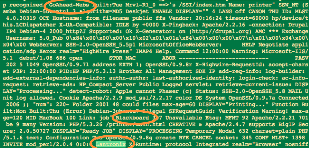
It’s easy for anyone to call out things that could happen with the IoT growth. Medical devices can be hacked , SmartMeters can be compromised and steal privacy information, the utility grid is widening its attack surface, drone video is intercepted and hacked , and countless others . Long live fear, uncertainty, and doubt, right?  While highlighting examples of IoT issues is important, the larger and more difficult thing for an organization to do is to communicate risk around IoT in a way that allows it to be managed.

Communicating IoT risk in an organization

Within an organization that already manages risk in some form, communicating and socializing the idea of IoT risk can be a challenge. There are at least two broad components to that challenge:

  • IoT defies traditional classification/categorization and is still little understood. It’s hard for people to wrap their heads around it
  • the other risks that the organization faces are still there. They haven’t gone away and IoT risk only adds to that

In order to begin to manage IoT risk, management must have some vocabulary for it. IoT is still new, its effects largely unknown and likely emergent, and precedents and analogies are few. We need to surface some language and concepts for it so that it can be discussed.

Another significant aspect of communicating IoT risk issues is that the other risks that an organization already faces — safety, liability, financial loss, reputation damage, technology challenges, business competition, and many more have not gone away. These risks are still there. We are asking senior management to make room in their list of existing risks that they are wrestling with to add yet more risk.  And possibly substantially more risk. Nobody wants to hear this.

Because of this, how we communicate these security, privacy, and risk issues is important. We are competing for a small slice of available cognitive bandwidth, so we must use this opportunity to communicate as well as we can.

Lather, Rinse, Repeat

If you either want to or are tasked with communicating IoT risk in your organization, I would suggest starting here:

  • find out what other risk the organization is already working with. Is there an annual report? Is there someone in the know in your network?
  • identify places where IoT is already in your organization or where you expect it
  • use the language of managing existing risk in your organization to begin to talk about IoT risk. If you have existing IoT risk examples, describe them in traditional risk language for your organization
  • repeat

A key to this communication is to get some IoT risk concepts out early. Give management some language to use to reflect on IoT risk and to discuss with their peers. It’s also important not to be heavy-handed in the approach. Yes, IoT risk is important, the impacts potentially very high, and the opportunities for abuse many, but the other existing risks that an organization faces haven’t gone away and they still must be managed too.

Chip producer ARM — major IoT player?

ARM ChipUK company ARM Holdings appears to be backing up its claims as a major processor design player in the Internet of Things (IoT) market. ARM signed 53 licenses for processor designs compared with 26 the previous year.

Smart phones to IoT

While ARM is the chip designer behind the vast majority of the smart phones in the world, it is also aggressively entering the machine-to-machine market, a significant subset of the Internet of Things.

ARM further signaled its interest in Internet of Things marketshare with its purchase of Offspark last week, an IoT security firm. The company is also moving into server technology which, given the symbiotic relationship of IoT and the Cloud, could be a winning combination. ARM produced 12 billion chips in 2014.

Over 25 IoT devices per person on the planet

While some predict ARM might be slowing because of projected reduced smart phone sales, projections of 25 plus networked computing devices per person on the Earth, might give ARM plenty of room to work.

FTC IoT guideline describes complexity, nuance of IoT

FTC IoT development guidelines http://1.usa.gov/1LeGOpX

FTC IoT development guidelines http://1.usa.gov/1LeGOpX

The Federal Trade Commission (FTC) has issued a guideline to companies developing Internet of Things (IoT) products and services. The guideline addresses security, privacy, encryption, authentication, permission control, testing, default settings, patch/software update planning, customer communication and education, and others.

IoT irony

The irony is that the comprehensiveness of the document, the things to plan for and look out for when developing IoT devices and systems, is the same thing that makes me think that the preponderance of device manufacturers will never do most of the things suggested. At least not in the near term. Big companies that have established brand, (eg Microsoft, Cisco, Intel, others) will have the motivation (and capacity) to participate in most of these recommendations. However, the bulk of the companies and likely the bulk of the total IoT device/system marketplace entries will be from the long tail of companies and businesses.

These companies are the smaller companies and startups that are just trying to get into the game. They won’t have an established brand across a large consumer base. This can also be read as, ‘they don’t have as much to lose’. Their risk and resource allocation picture does not include an established brand that needs to protected. They don’t have a brand yet. For most of these startup and small companies, they will view their better play to be:

  • throw our cool idea out there
  • get something on the market
  • if we get a toehold & start to establish some brand, then  we’ll start to worry about being more comprehensive with the FTC suggestions

Change

Again, to be clear, I am appreciative of the FTC guideline for manufacturers and developers of Internet of Things devices. It’s a needed document and is thoughtful, well-written, and thorough. However, the same document can’t help but illustrate all of the variables and complexities of networked computing regarding privacy and security concerns — the same privacy and security concerns that most companies will have insufficient resources and motivation to address.

We’re in for a change. It’s way more complicated than just ‘bad or good’. Where we help protect and manage risk for our organizations, we’re going to have to change how we approach things in our risk management and security efforts. No one else is going to do it for us.

Side effect of IoT growth – more attack platforms

iotgrowth

Rapid growth brings many good things, but also drives how we manage risk. [Image: theconnectivist.com http://bit.ly/1owv1dp]

The rapid growth of the Internet of Things (IoT) phenomenon, along with its corresponding rapid growth in device count, has been the talk about town over the past year or so. While IoT promises many good things, more conversation is being directed toward the risk brought about by the Internet of Things. Often this is in the form of someone will hack your web cams, steal your FitBit health information, hijack your routers and printers, or monkey with your thermostat remotely. While all important risks and concerns, I think that the bigger IoT risk has more to do with the sheer numbers of devices.

IoT devices as attack enablers

In all of the hoopla and coolness and excitement of the Internet of Things, we can sometimes forget the underlying subtle and amazing thing that they are all networked computing devices, many with well known and well understood operating systems. So, for a moment, forget that cool thing that the IoT device does in its local environment (capture video, audio, biometric authentication information, health information, temperature, humidity, refrigerator status, air composition, etc) and just remember that they are networked computing devices — many of these with substantial computing resources.

What this means is that IoT devices are not just targets themselves, but can also act as attack enablers or attack platforms. This can occur via direct hack or by unwitting participation in a botnet.

turkishpipelinehack

Baku-Tbilisi-Ceyhan (BTC) pipeline near the eastern Turkish city of Erzincan on Aug. 7, 2008.

From this recent analysis of a 2008 Turkish pipeline hack and sabotage:

“As investigators followed the trail of the failed alarm system, they found the hackers’ point of entry was an unexpected one: the surveillance cameras themselves.

The cameras’ communication software had vulnerabilities the hackers used to gain entry and move deep into the internal network, according to the people briefed on the matter.

Once inside, the attackers found a computer running on a Windows operating system that was in charge of the alarm-management network, and placed a malicious program on it. That gave them the ability to sneak back in whenever they wanted.”

So, the networked computing presence of the cameras themselves were used as a stepping stone (aka attack point) into the larger network. Some weakness in the operating system (OS) of the camera devices themselves provided a point of entry (‘vector’ in geek speak) into the pipeline’s operational network.

Big numbers

So, if we look at the growth in the number of IoT devices and consider them, for now, only as networked computing devices capable of being compromised, that’s a lot of new stepping stones for attacks.

These growing number of devices can enable & assist attacks by:

1) providing many more attack platforms, which …
2) provides more opportunities for indirection in attack, which …
3) makes attribution more difficult

buttonsLet’s get transitive – Kauffman’s buttons

At the risk of being a little bit tangential, all this reminds me of another network phenomenon, dealing with botnets, that I believe occurs. It is one that is exacerbated by the rapid increase in networked computing nodes, eg from IoT growth and has to do with how quickly the character of a network can change under fairly simple conditions.

I’ve always been intrigued with this ‘toy problem’ that Stuart Kauffman describes in his book, At Home in the Universe. He says to imagine that you have a bunch of buttons on the floor and some pieces of thread. You arbitrarily pick two buttons and then connect them with a piece of thread, a button at each end. Then you arbitrarily pick two more buttons and connect those two. (The original buttons are not excluded; they are still contenders. ) Keep doing this. While doing so, create a graph and plot the thread to number of buttons ratio on the X axis and the size of the largest cluster on the Y axis.

kauffman

Not too much happens at first. Early on, the largest button cluster stays pretty small. Then, at a certain point, the size of the largest cluster leaps. Logically, it’s not surprising. You can see how it happens. However, I still find myself staring at that big jump. That’s a real phase change for at least one aspect of that button network.

kauffman2

Quite a leap — https://keychests.com/media/bigdisk/pdf/16096.pdf


I think a similar thing happens with some botnets, particularly P2P botnets, as they grow in size. We can make the reasonable assumption that some botnet sizes are more effective than others at carrying out their varied nefarious tasks, eg 1000 is probably better than 10. While individual bots in botnets do not connect to all of the other bots on the network, they do connect to many.

IoT growth => More buttons

In this environment, I think Kauffman’s toy problem still applies. Namely, at some point, the largest cluster size grows very rapidly. Maybe not with the near-vertical drama of Kauffman’s problem where everything can be connected, but still with a significant acceleration in growth of the largest cluster once a critical point is reached. And if the largest cluster size suddenly meets or exceeds that putative optimal botnet size, well then, we’ve got ourselves an effective botnet.

So if the rapid growth in IoT provides many more buttons, then there are also many more buttons/potential botnet participants for the network. And the fact that these botnets can fairly suddenly (aka seemingly arbitrarily) reach their optimal effectiveness adds another air of uncertainty and difficult-to-predictness to the whole thing.

Not gloom & doom, but evolving risk picture

The sky is not falling and the Internet of Things holds much promise, but the way we look at risk will need to change. The advent and rapid growth of the Internet of Things will change some of the math on the Internet. More botnets will come online and they will do so in unpredictable ways. I’m not saying the end is near, but rather the way we look at risk will have to change.

Attacks on internet of things top security predictions for 2015

iotattacks

Attacks on Internet of Things tops list of Symantec’s 2015 Security Predictions. The post and infographic say that there will be a particular focus on smart home automation. Interestingly, the blog post references what is likely the Shodan database, referring to it as a “search engine that allows people to do an online search for Internet-enabled devices,” but does not mention it by name. While attacks on IoT devices/systems or attacks via IoT devices/systems is certainly not the only risk, it is further evidence that the attack surface provided by the rapid growth of IoT/ICS devices and systems is a burgeoning risk sector.

The report also highlights attacks on mobile devices, continuing ransomware attacks, and DDOS attacks.

Cerealboxing Shodan data

luckycharmsIn 2010, Steve Ocepek did a presentation at  DefCon where he introduced an idea that he called ‘cerealboxing’.  In it, he made a distinction between visibility and visualization. He suggested that visualization uses more of our ability to reason and visibility is more peripheral and taps into our human cognition.  He references Spivey and Dale in their paper Continuous Dynamics in Real-Time Cognition in saying:

“Real-time cognition is best described not as a sequence of logical operations performed on discrete symbols but as a continuously changing pattern of neuronal activity.”

Thinking on the back burner

Steve’s work involved building an Arduino-device that provides an indication of the source country of spawned web sessions while doing normal web browsing.  The idea was that as you do your typical browsing work, the device, via numbers and colors of illuminated LEDs would give an indication of how many web sessions were spawned on any particular page and where those sessions sourced from.  I built the device myself, ran it, and it was enlightening (no pun intended).

Using Steve’s device, while focused on something else — my web browsing, I had an indication out of the corner of my eye that I processed somewhat separately from my core task of browsing.  Without even trying or ‘thinking’, I was aware when a page lit up with many LED’s and many colors (indicating many sessions from many different countries).  I also became aware when I was seeing many web pages, regardless of my activity, that came from Brazil, for example.

Cerealbox

Steve named this secondary activity ‘cerealboxing’ as when you mindlessly read a cereal box at breakfast.  From one of his presentation slides:

  • Name came from our tendency to read/interpret anything in front of us
  • Kind of a “background” technology, something that we see peripherally
  • Pattern detection lets us see variances without digging too deep
  • Just enough info to let us know when it’s time to dig deeper

Back to excavating Shodan data

As I mentioned in my last post, Shodan data offers a great way to characterize some of the risk on your networks.  The challenge is that there is a lot of data.

One of the things that I want to know is what kinds of devices are showing up on my networks? What are some indicators? What words from ‘banner grabs’ indicate web cams, Industrial Control Systems, research systems, environmental control systems, biometrics systems, and others on my networks?  I started with millions of tokens.  How could I possibly find out interesting or relevant ‘tokens’ or key words in all of these?

To approach this, I borrowed the cerealboxing idea and wrote a script that continuously displays this data on a window (or two) on my computer. And then just let it run while I’m doing other things. It may sound odd, but I found myself occasionally glancing over and catching an interesting word or token that I probably would not have seen otherwise.

cerealboxunordered

unordered tokens

So, in a nutshell, I approached it this way:

  • tokenize all of the banners in the study
  • I studied banners from my organization as well as peer organizations
  • do some token reduction with stoplists & regular expressions, eg 1 & 2 character tokens, known printers, frequent network banner tokens like ‘HTTP’, days of the week, months, info on SSH variants, control characters that made the output look weird, etc
  • scroll a running list of these in the background or on a separate machine/screen

I also experimented with sorting by length of the tokens to see if that was more readable:

ordered5char

sorted by order — this section showing tokens (words) of 5 characters in length

In the course of doing this, I update a list of related tokens.  For example, some tokens related to networked cameras:

partiallist_networkcamera

And some related to audio and videoconferencing:

partiallist_telecom_videoconf

This evolving list of tokens will help me identify related device and system types on my networks as I periodically update the sample.

This is a fair amount of work to get this data, but once the process is identified and scripts written, it’s not so bad. Besides, with over 50 billion networked computing devices online in the next five years, what are you gonna do?

Excavating Shodan Data

excavator

A shovel at a time

The Shodan data source can be a good way to begin to profile your organization’s exposure created by Industrial Control Systems (ICS) and Internet of Things (IoT) devices and systems. Public IP addresses have already been scanned for responses to known ports and services and those responses have been stored in a searchable web accessible database — no muss, no fuss. The challenge is that there is A LOT of data to go through and determining what’s useful and what’s not useful is nontrivial.

Data returned from Shodan queries are results from ‘banner grabs’ from systems and devices. ‘Banner grabs’ are responses from devices and systems that are usually in place to assist with installing and managing the device/system. Fortunately or unfortunately, these banners can contain a lot of information. These banners can be helpful for tech support, users, and operators for managing devices and systems. However, that same banner data that devices and systems reveal about themselves to good guys is also revealed to bad guys.

What are we looking for?

So what data are we looking for? What would be helpful in determining some of my exposure? There are some obvious things that I might want to know about my organization. For example, are there web cams reporting themselves on my organization’s public address space? Are there rogue routers with known vulnerabilities installed? Industrial control or ‘SCADA’ systems advertising themselves? Systems advertising file, data, or control access?

The Shodan site itself provides easy starting points for these by listing and ranking popular search terms in it’s Explore page. (Again, this data is available to both good guys and bad guys). However, there are so many new products and systems and associated protocols for Industrial Control Systems and Internet of Things that we don’t know what they all are. In fact, they are so numerous and growing that we can’t know what they all are.

So how do we know what to look for in the Shodan data about our own spaces?

Excavation

My initial approach to this problem is to do what I call excavating Shodan data. I aggregate as much of the Shodan data as I can about my organization’s public address space. Importantly, I also research the data of peer organizations and include that in the aggregate as well. The reason for this is that there probably are some devices and systems that show up in peer organizations that will eventually also show up in mine.

Next, using some techniques from online document search, I tokenize all of the banners. That is, I chop up all of the words or strings into single words or ‘tokens.’ This results in hundreds of thousands of tokens for my current data set (roughly 1.5 million tokens). The next step is to compute the frequency of each, then sort in descending order, and finally display some number of those discovered words/tokens. For example, I might say show me the 10 most frequently occurring tokens in my data set:

devices1st10

Top 10 most frequently occurring words/tokens — no big surprises — lots of web stuff

I’ll eyeball those and then write those to a stoplist so that they don’t occur in the next run. Then I’ll look at the next 10 most frequently occurring. After doing that a few times, I’ll dig deeper, taking bigger chunks, and ask for the 100 most frequently occurring. And then maybe the next 1000 most frequently occurring.

This is the excavation part, gradually skimming the most frequently occurring off the top to see what’s ‘underneath’. Some of the results are surprising.

‘Password’ frequency in top 0.02% of banner words

Just glancing at the top 10, not much is surprising — a lot of web header stuff. Taking a look at the top 100 most frequently occurring banner tokens, we see more web stuff, NetBIOS revealing itself, some days of the week and months, and other. We also see our first example of third party web interface software with Virata-EmWeb. (Third party web interface software is interesting because a vulnerability here can cross into multiple different types of devices and systems.) Slicing off another layer and going deeper by 100, we find the token ‘Password’ at approximately the 250th most frequently occurring point. Since I’m going through 1.5 million words (tokens), that means that ‘Password’ frequency is in the top 0.02% or so of all tokens. That’s sort of interesting.

But as I dig deeper, say the top 1500 or so, I start to see Lantronix, a networked device controller, showing up. I see another third party web interface, GoAhead-Webs. Blackboard often indicates Point-of-Sale devices such as card swipers on vending machines. So even looking at only the top 0.1% of the tokens, some interesting things are showing up.

LantronixGoAheadBB

Digging deeper — Even in the top 0.1% of tokens, interesting things start to show up

New devices & systems showing up

But what about the newer, less frequently occurring, banner words (tokens) showing up in the list? Excavating like this can clearly get tedious, so what’s another approach for discovery of interesting, diagnostic, maybe slightly alarming words in banners on our networks? In a subsequent post, I’ll explain my next approach that I’ve named ‘cerealboxing’, based on an observation and concept of Steve Ocepek’s regarding our human tendency to automatically read, analyze, and/or ingest information in our environment, even if passively.

Poor Man’s Risk Visualization II

Categorizing and clumping (aggregating) simple exposure data from the Shodan database can help communicate some risks that otherwise might have been missed.  Even with the loss of some accuracy (or maybe because of loss of accuracy), grouping some data into larger buckets can help communicate risk/exposure. For example, a couple of posts ago in Poor Man’s Industrial Control System Visualization, Shodan data was used to do a quick visual analysis of what ports and services are open on publicly available IP addresses for different organizations. Wordle was used to generate word clouds and show relative frequency of occurrence where ‘words’ where actually port/service numbers.

Trading-off some accuracy for comprehension

This is great for yourself or colleagues that are also fairly familiar with port numbers, the services that they represent, and what their relative frequencies might imply. However, often we’re trying to communicate these ideas to business people and/or senior management. Raw port numbers aren’t going to mean much to them. A way to address this is to pre-categorize the port numbers/services so that some of them clump together.

Yes, there is a loss of some accuracy with this approach — whenever we generalize or categorize, there is a loss of information.  However, when the domain-specific information makes it difficult or impossible to communicate to another that does not work in that domain (with some interesting parallels to the notion of channel capacity), it’s worth the accuracy loss so that something useful gets communicated. Similar to the earlier post of port/service numbers only, one organization has this ‘port number cloud’:

org1portnum

A fair amount of helpful quick-glance detail consumable by the IT or security professional, but not much help to the non-IT professional

Again, this might have some utility to an IT or security professional, but not much to anyone else. However, by aggregating some of the ports returned into categories and using descriptive words instead, something more understandable by business colleagues and/or management can be rendered:

org1word

For communicating risk/exposure, this is a little more readable & understandable to a broader audience, especially business colleagues & senior management

How you categorize is up to you. I’ll list my criteria below for these examples. It’s important not to get too caught up in the nuance of the categorization. There are a million ways to categorize and many ports/services serve a combination of functions. You get to make the cut on these categories to best illustrate the message that you are trying to get across. As long as you can show how you went about it, then you’re okay.

portcat

One way to categorize ports — choose a method that best helps you communicate your situation

The port number and ‘categorized’ clouds for a smaller organization with less variety are below.


org2portnum

A port number ‘cloud’ for a different (and smaller) organization with less variety in port/service types

org2word

The same port/service categorization as used above, but for the smaller organization, yields a very different looking word cloud

One challenge with the more clear approach is that your business colleagues or senior management might leap to a conclusion that you don’t want them too. For example, you will need to be prepared for the course of action that you have in mind. You might need to explain, for example, that though there are many web servers in your organization, your bigger concern might be exposure of telnet and ftp access, default passwords, or all of the above.

This descriptive language categorization approach can be a useful way to demonstrate port/service exposure in your organization, but it does not obviate the need for a mitigation plan.

Borrowing from search to characterize network risk

Most frequently occurring port is in outer ring, 2nd most is next ring in, ...

Most frequently occurring port is in outer ring, 2nd most is next ring in, …

Borrowing some ideas from document search techniques, data from the Shodan database can be used to characterize networks at a glance. In the last post, I used Shodan data for public IP spaces associated with different organizations and Wordle to create a quick and dirty word cloud visualization of exposure by port/service for that organization.

The word cloud idea works pretty well in communicating at a glance the top two or three ports/services most frequently seen for a given area of study (IP space).  I wanted to extend this a bit and compare organizations by a linear rank of the most frequently occurring services seen on that organization’s network.  So I wanted to capture both the most frequently occurring ports/services as well as the rank amongst those and then use those criteria to potentially compare different organizations (IP spaces).

Vector space model

I also wanted to experiment with visualizing this in a way that would give at a glance something of a ‘signature’.  Sooooo, here’s the idea: document search often uses this idea of a vector space model where documents are broken down into vectors.  The vector is a list of words representing all of the words that occur in that document.  The weight given to each word (or term or element) in the vector can be computed in a number of different ways, but one of the most popular is frequency with which that word occurs in that document (and sometimes with which it occurs in all of the documents combined).

A similar idea was used here, except that I used frequency with which ports/services appeared in an organization instead of words in a document. I looked at the top 5 ports/services that appeared.  I also experimented with the top 10 ports/services, but that got a little busy on the graphic and it also seemed that as I moved further down the ordered port list — 8th most frequent, 9th most frequent, etc — that these additional ports were adding less and less to the characterization of the network. Could be wrong, but it just seemed that way at the time.

I went through 12 organizations and collected the top 5 ports/services in each. Organizations varied between approximately 10,000 and 50,000 IP addresses. To have a basis for comparison of each organization, I used a list created by the ports returned from all of the organizations’ Top 5 ports.

Visualizing port rank ‘signatures’

A polar plot was created where each radial represents each port/service.  The rings of the plot represent the rank of that port — most frequently occurring, 2nd most frequently occurring, …, 5th most frequently occurring. I used a polar plot because I wanted something that might generate easily recognizable shapes or patterns. Another plot could have been used, but this one grabbed my eye the most.

Finally, to really get geeky, to measure similarity in some form, I computed the Euclidean distance between each possible vector pair. Two of the closest organizations of the 12 analyzed are (that is most similar port vectors):


mostsimilar

2 of the most similar organizations by Euclidean distance — ports 21, 23, & 443 show up with the same rank & port 80 shows up with a rank difference of only 1. This makes them close.  (Euclidean distance of ~2.5)

Two of the furthest way of the 12 studied are these (least similar port vectors):


leastsimilar

While port 80 aligns between the two (has the same rank) and port 22 is close in rank between the two, there is no alignment between ports 23, 3389, or 5900. This non-alignment, non-similar port rank, creates more distance between the two. (Euclidean distance of ~9.8)

Finally, this last one is some where in the middle (mean) of the pack:


midsimilar

A distance chosen from the middle of the sorted distance (mean). Euclidean distance is ~8.7. Because this median value is much closer to the most dissimilar, it seems to indicate a high degree of dissimilarity across the set studied (I think).

Overall, I liked the plots. I also liked the polar approach. I was hoping that I would see a little more of a ‘shape feel’, but I only studied 12 organizations.  I’d like to add more organizations to the study and see if additional patterns emerge. I also tried other distance measuring methods (Hamming, cosine, jaccard, Chebyshev, cityblock, etc) because they were readily available and easy to use with the scipy library that I was using, but none offered a noticeable uptick in utility over the plain Euclidean measure.

Cool questions from this to pursue might be:

1. For similar patterns between 2 or more organizations, can history of network development be inferred? Was a key person at both organizations at some point? Did one org copy another org?

2. Could the ranked port exposure lend itself to approximating risk for combined/multiprong cyber attack?

Again, if you’re doing similar work on network/IP space characterization and want to share, please contact me at ChuckBenson at this website’s domain for email.

Poor Man’s Industrial Control System Risk Visualization

The market is exploding with a variety of visualization tools to assist with ‘big data’ analysis in general and security and risk awareness analysis efforts in particular. Who the winner is or winners are in this arena is far from settled and it can be difficult to figure out where to start. While we analyze these different products and services and try some of our own approaches, it is good to keep in mind that there can also be some simple initial value-add in working with quick and easy, nontraditional (at least in this context), visualization

Even simple data visualization can be helpful

I’ve been working with some Shodan data for the past year or so. Shodan, created by John Matherly, is a service that scans several ports/services related to Industrial Control Systems (ICS) and, increasingly, Internet of Things sorts of devices and systems. The service records the results of these scans and puts them in a web accessible database. The results are available online or via a variety of export formats to include csv, json, and xml (though xml is deprecated). In his new site format, Matherly also makes some visualizations of his own available. For example, here’s one depicting ranked services for a particular subset of IP ranges that I was analyzing:

Builtin Shodan visualization -- Top operating systems in scan

One of the builtin Shodan visualizations — Top operating systems

Initially, I wanted to do some work with the text in the banners that Shodan returns, but I found that there was some even simpler stuff that I could do with port counts (number of times a particular port shows up in a subset of IP addresses) to start. For example, I downloaded the results from a Shodan scan, counted the occurrences for each port, ran a quick script to create a file of repeated ‘words’ (actually port numbers), and then dropped that into a text box on Wordle.

Inexpensive (free) data visualization tools

Wordle is probably the most popular web-based way of creating a word cloud. You just paste your text in here (repeated ports in our case):

Just cut & paste ports

Just cut & paste ports into Wordle

Click create and you’ve got a word cloud based on the number of ports/services in your IP range of interest. Sure you could look at this in a tabular report, but to me, there’s something about this that facilitates increased reflection regarding the exposure of the IP space that I am interested in analyzing.


org3portwordle

VNC much? Who says telnet is out of style ?

[For some technical trivia, I did this by downloading the Shodan results into a json file, used python to import, parse, and upload to a MySQL database, and then ran queries from there. Also, Wordle uses Java so it didn’t play well with Chrome and I switched to Safari for Wordle.]

In addition to quickly eyeball-analyzing an IP space of interest, it can also make for interesting comparisons between related IP spaces. Below are two word clouds for organizations that have very similar missions and staff make up. You would, I did anyway, expect their relative ports counts and word clouds to be fairly similar. As the results below show, however, they may be very different.

org1portwordle

Organization 1’s most frequently found ports/services

org2portwordle

Organization 2’s most frequent ports/services — same mission and similar staffing as Org 1, but network (IP space) has some significant differences

Next steps are to explore a couple of other visualization ideas of using port counts to characterize IP spaces and then back to the banner text analysis. Hopefully, I’ll have a post on that up soon.

If you’re doing related work, I would be interested in hearing about what you’re exploring.