Tag Archives: heat map

Frog Boiling and Shifting Baselines

There is an apocryphal anecdote that a frog can be boiled to death if it is placed in a pan with room temperature water and then slowly heating the water to boiling. The idea is that the frog continues to acclimate to the new temperature which is only slightly warmer than the previous temperature (if the temp went up in incremental chunks) and so it is never in distress and never tries to jump out. A less PETA-evoking metaphor is that of a ‘shifting baseline’ which was originally used to describe a problem in measuring rates of decline in fish populations. The idea here is that skewed research results stemmed from choosing a starting point that did not reflect changes in fish populations that had already occurred which resulted in an order of magnitude of change that was not accounted for.

We can also see this sort of effect in risk management activities where risks that were initially identified with a particular impact and likelihood (and acceptability) seem to slide to a new place over time on the risk heat map. This can be a problem because often the impact and the probability did not change and there’s no logical reason for the level of risk acceptability to have changed. I believe this slide can happen for a number of reasons:

  • we get accustomed to having the risk; it seems more familiar and (illogically) less uncertain the longer we are around it
  • we tell ourselves that because the risk event didn’t happen yesterday or the day before, then it probably won’t happen today either. This is flawed thinking! (In aviation we called this complacency).
  • we get overloaded, fatigued, or distracted and our diligence erodes
  • external, financial, and/or political pressures create an (often insidious) change in how we determine what risk is acceptable and what is not. That is, criteria for impact and/or probability is changed without recognition of that change.

Challenger Disaster

Challenger_explosion

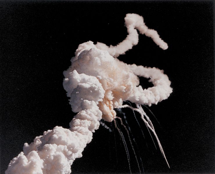
Challenger plume after explosion

In 1986, the Space Shuttle Challenger exploded 71 seconds after liftoff. The Rogers Commission, established to investigate the mishap, created a report and panel debrief to include the testimony by the iconic Richard Feynman. Chapter 6 of the report, entitled “An Accident Rooted in History” opens with, “The Space Shuttle’s Solid Rocket Booster problem began with the faulty design of its joint and increased as both NASA and contractor management first failed to recognize it as a problem, then failed to fix it and finally treated it as an acceptable flight risk.” (italics added) Let’s recap that:

  • initially failed to formally recognize it as a problem (but later did)
  • failed to fix it
  • morphed into an acceptable flight Risk

When further testing confirmed O Ring issues, instead of fixing the problem, “the reaction by both NASA and Thiokol (the contractor) was to increase the amount of damage considered ‘acceptable’.” That is, in effect, they changed criteria for risk.  Implicitly, and by extension, loss of life and vehicle was now more acceptable.


For risk to become acceptable, the criteria for impact and/or probability would have had to change -- even if implicitly

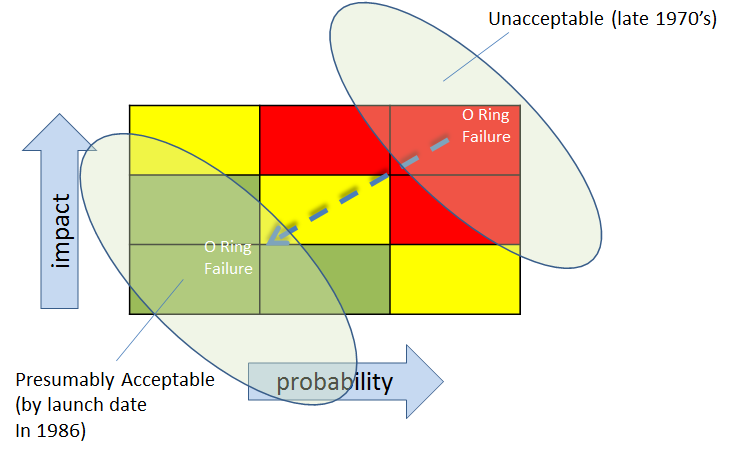
For risk to become acceptable, the criteria for impact and/or probability would have had to change — even if implicitly

Physicist Richard Feynman, on the Commission, observed:

“a kind of Russian roulette. … (The Shuttle) flies (with O-ring
erosion) and nothing happens. Then it is suggested, therefore, that
the risk is no longer so high for the next flights. We can lower our
standards a little bit because we got away with it last time. … You
got away with it, but it shouldn’t be done over and over again like
that.”

This is the sort of frog boiling or baseline shifting that we talked about earlier. Though there were many contributing factors, I believe that one of them was that they simply got familiar with and comfortable with the risk. In a way, the risk was ‘old news’.

Frog Boiling in Information Risk Management

This kind of frog boiling or baseline shifting can happen with Information Risk Management as well. As we become inundated with tasks, complexity, and knowledge of new threats and vulnerabilities, it can be tempting to reduce the importance of risk issues that were established earlier. That is, we can have a tendency to put a higher priority on the issue(s) that we have been most recently dealing with. If we are not careful, the perceptions of earlier risks can actually change.  Gregory Berns discusses perception change in his book, Iconoclast.

It’s one thing to consciously re-evaluate our tolerance for difference types of risk because we have new information and new things to consider, but it is another to let our tolerance for risk slide because of fatigue, ‘information overload’, political pressure, or distraction.

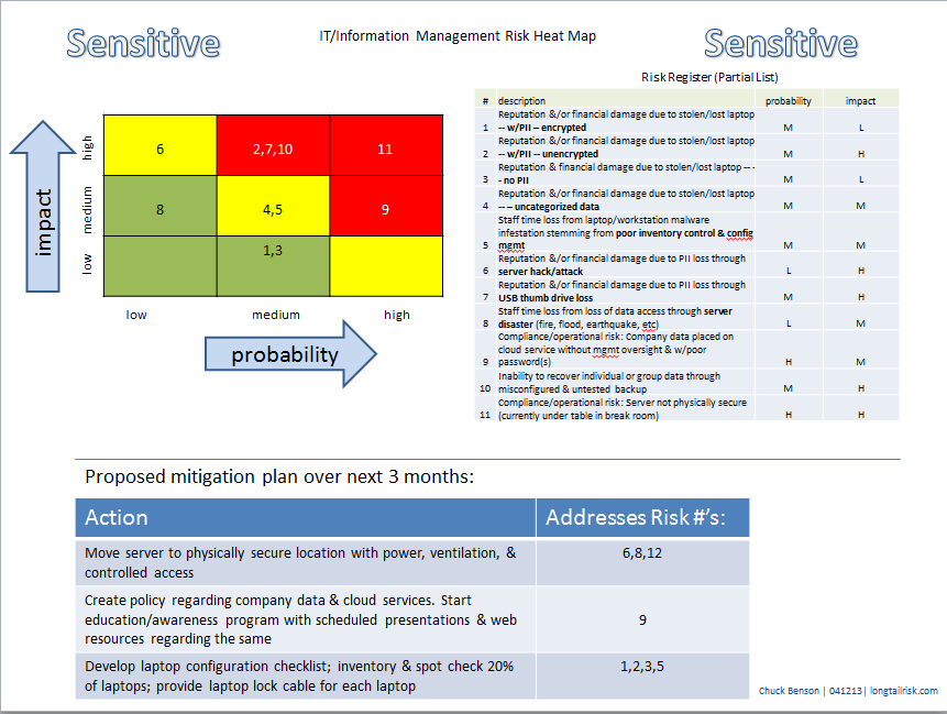
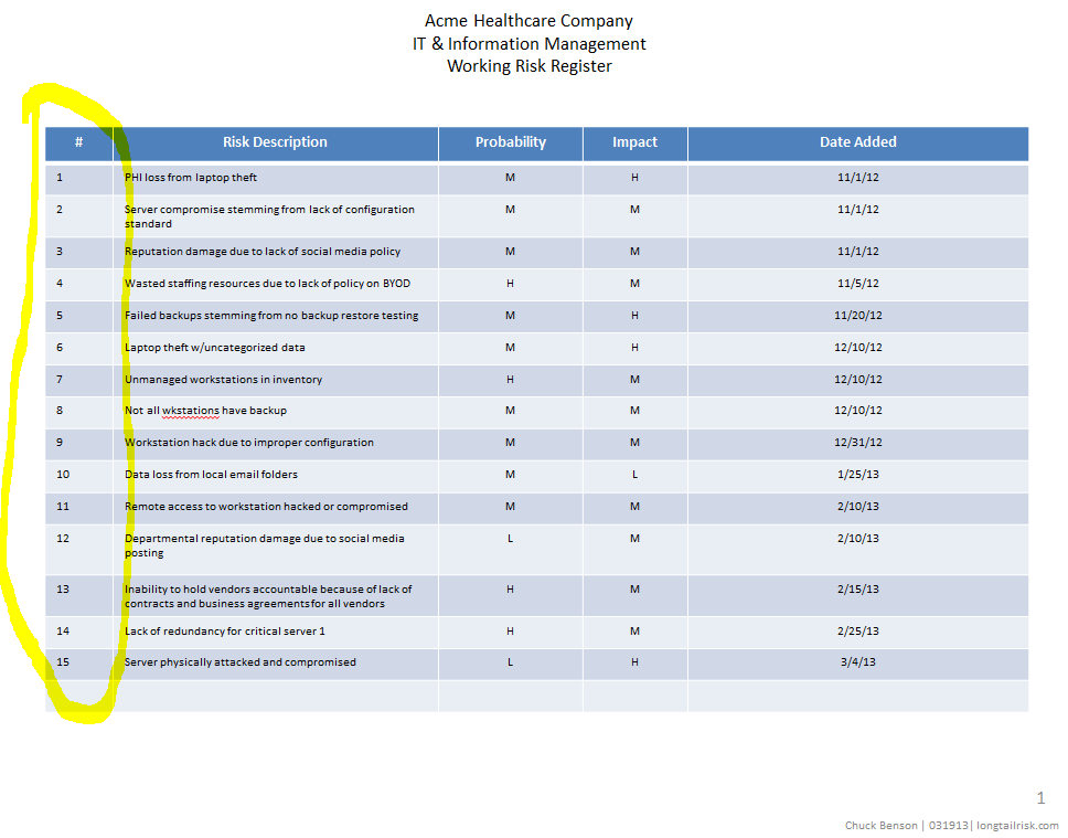
More than once I’ve picked up an older Information Risk Register & Heat Map and reminded myself that there were unmitigated risks that were still there. Yes, since that time, I had new risks to deal with, but that didn’t mean that the original ones went away.

One way to help us address this non-overt perception change is to use our earlier Risk Registers and Heat Maps.

      • Look at it again.
      • Did the original issues really go away?
      • Did their impacts or likelihoods really lessen?

It may well be that with new knowledge of threats, vulnerabilities, and capabilities, that we have to revisit and adjust (usually increase) our tolerance for risk given our limited resources. That is fine and appropriate. However, this needs to be a conscious effort. Changing the importance of a risk issue, whether it be its impact or probability, because we are tired, overwhelmed, or because the issue is ‘old news’ doesn’t help us. We need to be methodical and consistent with our approach. Otherwise, we are just fooling ourselves.


Have you had to change your risk tolerance in your organization?  Have you had to change your criteria for impact and probability? What were driving factors for re-assessing how you measure risk impact?


Communicate risk in a single page (the first time)

One of the most challenging aspects of work for an IT or information management professional is to communicate risk.  If you are in a resource-constrained business, e.g. small and medium size businesses (SMB), that hasn’t analyzed information risk before, consider communicating it the first time in a single page.

The reason for a single page communication is that risk can be so complicated and obscure and IT technologies, concepts, and vocabulary can also be complicated and obscure that the combination of both can go well beyond mystifying to an audience not familiar with either or both (which is most people).

A few years ago I was in a position to try to communicate information risk to a number of highly educated, highly accomplished, and high performing professionals with strong opinions (doctors).  I only had a tiny sliver of time and attention for them to listen to my pitch on the information risk in their work environment.  If I tried some sort of multi-page analysis and long presentation, I would have been able to hear the ‘clunk’ as their eyes rolled back in their heads.

Clearly, there was no lack of intellectual capacity for this group, but there was a lack of available bandwidth for this topic and I had to optimize the small amount that I could get.

After several iterations and some informal trials (which largely consisted of me pitching the current iteration of my information risk presentation while walking with a doc in the hall on the way to the operating room), I came up with my single page approach.  It consists of three components:

  • (truncated) risk register 
  • simple heat map
  • 2 – 3 mitigation tasks or objectives
Single Page Risk Plan Communication

Communicate risk in a single page (click to enlarge)

I put the attention-getting colorful heat map in the upper left hand corner, the risk register in the upper right, and a proposed simple mitigation plan at the bottom of the page.

This ended up being pretty successful.  I actually managed to engage them for 5 – 10 minutes (which is a relatively large amount of time for them) and get them thinking about information risk in their environment.

To communicate risk in a single page, I am choosing to leave information out.  This can tend to go against our nature in wanting to be very detailed, comprehensive, and thorough in everything that we do.  However, that level of detail will actually impede communication.  And I need to communicate risk.  By leaving information out, I actually increase the communication that occurs.

Also, notice in the Proposed Mitigation section, I am not proposing to solve everything in the register.  I am proposing to solve things that are important and feasible in a given time frame (three months in this case).

In three, six, or nine months, we can come back with a new presentation that includes results from the proposed mitigation in this presentation.

Notice that I put “Sensitive” in a couple of places on the document to try to remind people that we don’t want to share our weak spots with the world.

If at some point, your company leadership or other stakeholders want more detail, that’s fine.  If they ask for it, they are much more likely to be able and willing to consume it.

To communicate risk, start simple.  If they want more, you’ll be ready by being able to use your working risk register as a source.  I’ll be willing to be bet, though, that most will be happy with a single page.


Have you presented information risk to your constituents before? What techniques did you use?  How did it go?

Creating simple information risk management heat maps

Visualization is a powerful tool for simple information risk analysis.  The simple of act of placing risks in spacial relationship to each other allows a quick overview of essential elements of your risk profile.  As importantly, it allows you to communicate that simple risk profile to others that aren’t as versed in information security, IT, and information management.  A popular risk visualization tool is an information risk heat map.

A couple of posts ago, I talked about creating a simple risk register.  In a nutshell, this is a list of things that can go wrong in the IT and information management part of your business with an estimate of how bad it would be and how likely you think it is to happen.  An example might be as simple as, “business shutdown for greater than 3 days because no backup for critical data — medium probability, high impact” or “data inaccessibility because of failure of cloud services provider — medium probability, medium impact.”

As a reminder, keep your analysis simple for probability and impact of event.  I suggest just Low, Medium, or High to start.  As a small or medium-sized company, you probably don’t have a lot of data to drive estimates for probability, so just make your best educated estimate. For example, if I’ve got a server with a RAID 5 configuration, I think the chances of 2 disks failing simultaneously (resulting in data loss) is Low.  Similarly, for impact, keep the analysis of impact pretty simple to start.  For example, amount of time offline might be a guideline for you — maybe 4 hours or less offline is Low impact for you, 4 hours to 2 days is Medium, and greater than 2 days is High.  How you define impact is a statement of your business’s “risk tolerance” and will vary from business to business. The main thing to remember is to not make it overly complicated.

The heat map is going to be a simple 3 x 3 grid with probability on one axis and impact on the other.  The cells inside the grid will contain the actual risks.

In the original risk register example, there were four columns: risk description, probability, impact, and then a column for date added. To create the heat map, we’re going to add one more column to the far left simply called Risk #.  This is just a number to identify the risk.  It doesn’t indicate any sort of risk priority.

information risk register with numeric indices

information risk register with numeric indices

Once you have the risk register that includes the Risk # column (which is just an index to the risk description and not a priority), start your heat map by creating a 3 x 3 grid with probability of the event happening on one axis and impact of the event of the other axis.

basic information risk heat map grid

basic information risk management heat map grid

If you’d like add some color:

information risk heat map grid with color

information risk management heat map grid with color

Finally, add the risk index #’s from your risk register


information risk heat map grid with risk indices

information risk management heat map grid with risk indices

Once people orient to axes on the heat map, their eyeballs generally go directly to the upper right hand corner of the heat map where the higher impact and probability events are. This is not a bad thing.

With your simple heat map, and without a lot of work, you now have some insight into your operation’s risk profile and are in a better position to make informed business decisions.


Have you created information risk registers or information risk heat maps before? What did you use for criteria for impact?