Tag Archives: service

Poor Man’s Risk Visualization II

Categorizing and clumping (aggregating) simple exposure data from the Shodan database can help communicate some risks that otherwise might have been missed.  Even with the loss of some accuracy (or maybe because of loss of accuracy), grouping some data into larger buckets can help communicate risk/exposure. For example, a couple of posts ago in Poor Man’s Industrial Control System Visualization, Shodan data was used to do a quick visual analysis of what ports and services are open on publicly available IP addresses for different organizations. Wordle was used to generate word clouds and show relative frequency of occurrence where ‘words’ where actually port/service numbers.

Trading-off some accuracy for comprehension

This is great for yourself or colleagues that are also fairly familiar with port numbers, the services that they represent, and what their relative frequencies might imply. However, often we’re trying to communicate these ideas to business people and/or senior management. Raw port numbers aren’t going to mean much to them. A way to address this is to pre-categorize the port numbers/services so that some of them clump together.

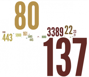
Yes, there is a loss of some accuracy with this approach — whenever we generalize or categorize, there is a loss of information.  However, when the domain-specific information makes it difficult or impossible to communicate to another that does not work in that domain (with some interesting parallels to the notion of channel capacity), it’s worth the accuracy loss so that something useful gets communicated. Similar to the earlier post of port/service numbers only, one organization has this ‘port number cloud’:
org1portnum

A fair amount of helpful quick-glance detail consumable by the IT or security professional, but not much help to the non-IT professional

Again, this might have some utility to an IT or security professional, but not much to anyone else. However, by aggregating some of the ports returned into categories and using descriptive words instead, something more understandable by business colleagues and/or management can be rendered:

org1word

For communicating risk/exposure, this is a little more readable & understandable to a broader audience, especially business colleagues & senior management

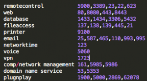
How you categorize is up to you. I’ll list my criteria below for these examples. It’s important not to get too caught up in the nuance of the categorization. There are a million ways to categorize and many ports/services serve a combination of functions. You get to make the cut on these categories to best illustrate the message that you are trying to get across. As long as you can show how you went about it, then you’re okay.

portcat

One way to categorize ports — choose a method that best helps you communicate your situation

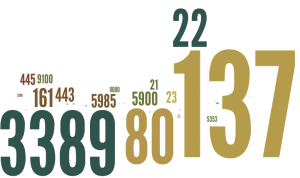
The port number and ‘categorized’ clouds for a smaller organization with less variety are below.
 

org2portnum

A port number ‘cloud’ for a different (and smaller) organization with less variety in port/service types

org2word

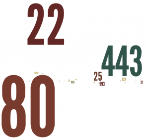
The same port/service categorization as used above, but for the smaller organization, yields a very different looking word cloud

One challenge with the more clear approach is that your business colleagues or senior management might leap to a conclusion that you don’t want them too. For example, you will need to be prepared for the course of action that you have in mind. You might need to explain, for example, that though there are many web servers in your organization, your bigger concern might be exposure of telnet and ftp access, default passwords, or all of the above.

This descriptive language categorization approach can be a useful way to demonstrate port/service exposure in your organization, but it does not obviate the need for a mitigation plan.

Poor Man’s Industrial Control System Risk Visualization

The market is exploding with a variety of visualization tools to assist with ‘big data’ analysis in general and security and risk awareness analysis efforts in particular. Who the winner is or winners are in this arena is far from settled and it can be difficult to figure out where to start. While we analyze these different products and services and try some of our own approaches, it is good to keep in mind that there can also be some simple initial value-add in working with quick and easy, nontraditional (at least in this context), visualization

Even simple data visualization can be helpful

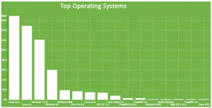
I’ve been working with some Shodan data for the past year or so. Shodan, created by John Matherly, is a service that scans several ports/services related to Industrial Control Systems (ICS) and, increasingly, Internet of Things sorts of devices and systems. The service records the results of these scans and puts them in a web accessible database. The results are available online or via a variety of export formats to include csv, json, and xml (though xml is deprecated). In his new site format, Matherly also makes some visualizations of his own available. For example, here’s one depicting ranked services for a particular subset of IP ranges that I was analyzing:

Builtin Shodan visualization -- Top operating systems in scan

One of the builtin Shodan visualizations — Top operating systems

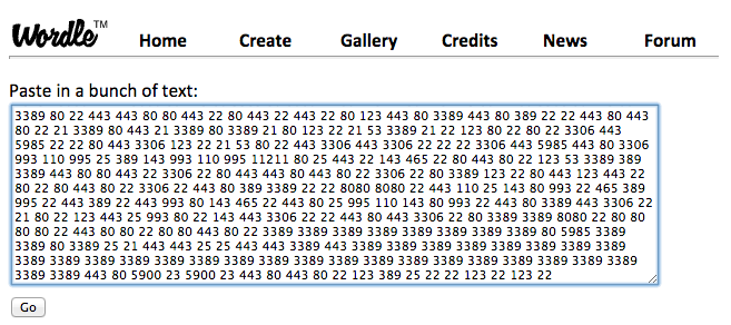
Initially, I wanted to do some work with the text in the banners that Shodan returns, but I found that there was some even simpler stuff that I could do with port counts (number of times a particular port shows up in a subset of IP addresses) to start. For example, I downloaded the results from a Shodan scan, counted the occurrences for each port, ran a quick script to create a file of repeated ‘words’ (actually port numbers), and then dropped that into a text box on Wordle.

Inexpensive (free) data visualization tools

Wordle is probably the most popular web-based way of creating a word cloud. You just paste your text in here (repeated ports in our case):

Just cut & paste ports

Just cut & paste ports into Wordle

Click create and you’ve got a word cloud based on the number of ports/services in your IP range of interest. Sure you could look at this in a tabular report, but to me, there’s something about this that facilitates increased reflection regarding the exposure of the IP space that I am interested in analyzing.


org3portwordle

VNC much? Who says telnet is out of style ?

[For some technical trivia, I did this by downloading the Shodan results into a json file, used python to import, parse, and upload to a MySQL database, and then ran queries from there. Also, Wordle uses Java so it didn’t play well with Chrome and I switched to Safari for Wordle.]

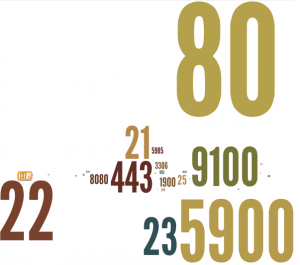
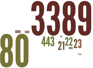
In addition to quickly eyeball-analyzing an IP space of interest, it can also make for interesting comparisons between related IP spaces. Below are two word clouds for organizations that have very similar missions and staff make up. You would, I did anyway, expect their relative ports counts and word clouds to be fairly similar. As the results below show, however, they may be very different.

org1portwordle

Organization 1’s most frequently found ports/services

org2portwordle

Organization 2’s most frequent ports/services — same mission and similar staffing as Org 1, but network (IP space) has some significant differences

Next steps are to explore a couple of other visualization ideas of using port counts to characterize IP spaces and then back to the banner text analysis. Hopefully, I’ll have a post on that up soon.

If you’re doing related work, I would be interested in hearing about what you’re exploring.