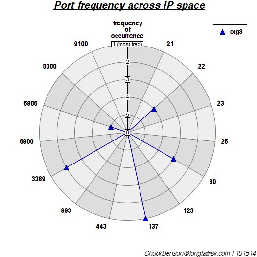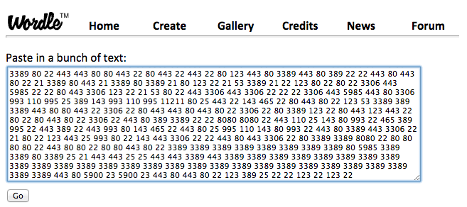
Categorizing and clumping (aggregating) simple exposure data from the Shodan database can help communicate some risks that otherwise might have been missed. Even with the loss of some accuracy (or maybe because of loss of accuracy), grouping some data into larger buckets can help communicate risk/exposure. For example, a couple of posts ago in Poor Man’s Industrial Control System Visualization, Shodan data was used to do a quick visual analysis of what ports and services are open on publicly available IP addresses for different organizations. Wordle was used to generate word clouds and show relative frequency of occurrence where ‘words’ where actually port/service numbers.
Trading-off some accuracy for comprehension
This is great for yourself or colleagues that are also fairly familiar with port numbers, the services that they represent, and what their relative frequencies might imply. However, often we’re trying to communicate these ideas to business people and/or senior management. Raw port numbers aren’t going to mean much to them. A way to address this is to pre-categorize the port numbers/services so that some of them clump together.
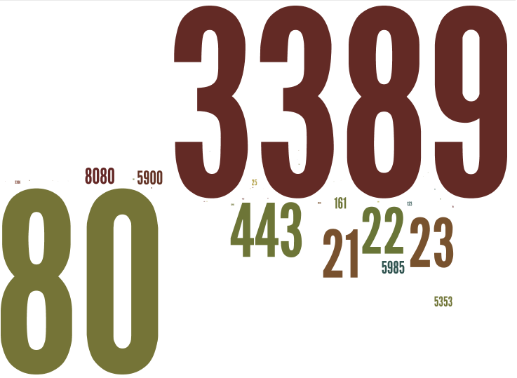
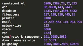
Yes, there is a loss of some accuracy with this approach — whenever we generalize or categorize, there is a loss of information. However, when the domain-specific information makes it difficult or impossible to communicate to another that does not work in that domain (with some interesting parallels to the notion of channel capacity), it’s worth the accuracy loss so that something useful gets communicated. Similar to the earlier post of port/service numbers only, one organization has this ‘port number cloud’:
A fair amount of helpful quick-glance detail consumable by the IT or security professional, but not much help to the non-IT professional
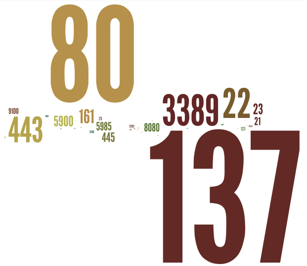
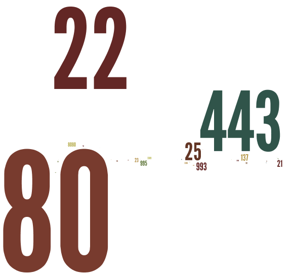
Again, this might have some utility to an IT or security professional, but not much to anyone else. However, by aggregating some of the ports returned into categories and using descriptive words instead, something more understandable by business colleagues and/or management can be rendered:

For communicating risk/exposure, this is a little more readable & understandable to a broader audience, especially business colleagues & senior management
How you categorize is up to you. I’ll list my criteria below for these examples. It’s important not to get too caught up in the nuance of the categorization. There are a million ways to categorize and many ports/services serve a combination of functions. You get to make the cut on these categories to best illustrate the message that you are trying to get across. As long as you can show how you went about it, then you’re okay.
One way to categorize ports — choose a method that best helps you communicate your situation
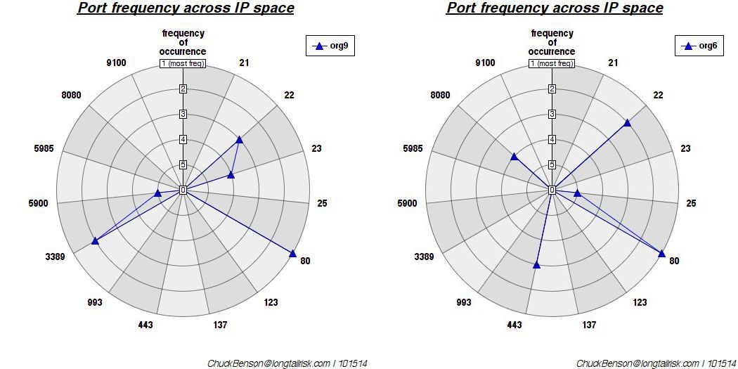
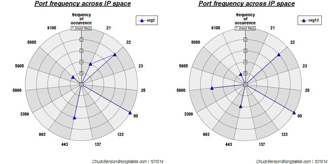
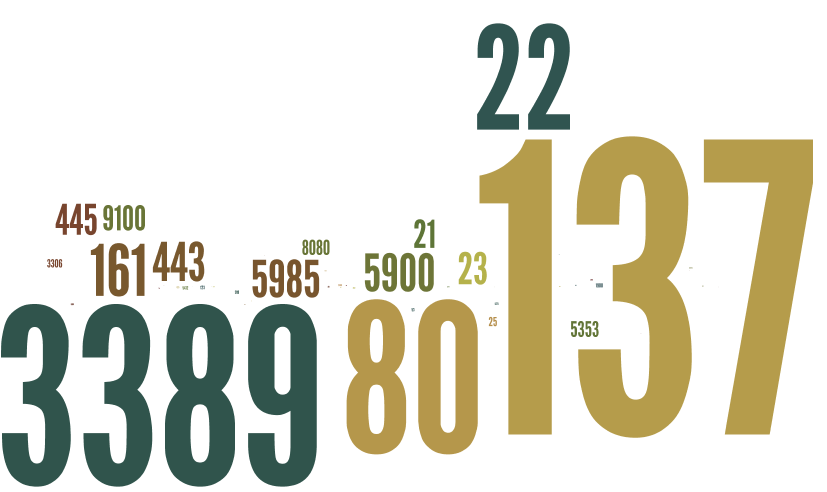
The port number and ‘categorized’ clouds for a smaller organization with less variety are below.
A port number ‘cloud’ for a different (and smaller) organization with less variety in port/service types

The same port/service categorization as used above, but for the smaller organization, yields a very different looking word cloud
One challenge with the more clear approach is that your business colleagues or senior management might leap to a conclusion that you don’t want them too. For example, you will need to be prepared for the course of action that you have in mind. You might need to explain, for example, that though there are many web servers in your organization, your bigger concern might be exposure of telnet and ftp access, default passwords, or all of the above.
This descriptive language categorization approach can be a useful way to demonstrate port/service exposure in your organization, but it does not obviate the need for a mitigation plan.