Tag Archives: exposure

Excavating Shodan Data

excavator

A shovel at a time

The Shodan data source can be a good way to begin to profile your organization’s exposure created by Industrial Control Systems (ICS) and Internet of Things (IoT) devices and systems. Public IP addresses have already been scanned for responses to known ports and services and those responses have been stored in a searchable web accessible database — no muss, no fuss. The challenge is that there is A LOT of data to go through and determining what’s useful and what’s not useful is nontrivial.

Data returned from Shodan queries are results from ‘banner grabs’ from systems and devices. ‘Banner grabs’ are responses from devices and systems that are usually in place to assist with installing and managing the device/system. Fortunately or unfortunately, these banners can contain a lot of information. These banners can be helpful for tech support, users, and operators for managing devices and systems. However, that same banner data that devices and systems reveal about themselves to good guys is also revealed to bad guys.

What are we looking for?

So what data are we looking for? What would be helpful in determining some of my exposure? There are some obvious things that I might want to know about my organization. For example, are there web cams reporting themselves on my organization’s public address space? Are there rogue routers with known vulnerabilities installed? Industrial control or ‘SCADA’ systems advertising themselves? Systems advertising file, data, or control access?

The Shodan site itself provides easy starting points for these by listing and ranking popular search terms in it’s Explore page. (Again, this data is available to both good guys and bad guys). However, there are so many new products and systems and associated protocols for Industrial Control Systems and Internet of Things that we don’t know what they all are. In fact, they are so numerous and growing that we can’t know what they all are.

So how do we know what to look for in the Shodan data about our own spaces?

Excavation

My initial approach to this problem is to do what I call excavating Shodan data. I aggregate as much of the Shodan data as I can about my organization’s public address space. Importantly, I also research the data of peer organizations and include that in the aggregate as well. The reason for this is that there probably are some devices and systems that show up in peer organizations that will eventually also show up in mine.

Next, using some techniques from online document search, I tokenize all of the banners. That is, I chop up all of the words or strings into single words or ‘tokens.’ This results in hundreds of thousands of tokens for my current data set (roughly 1.5 million tokens). The next step is to compute the frequency of each, then sort in descending order, and finally display some number of those discovered words/tokens. For example, I might say show me the 10 most frequently occurring tokens in my data set:

devices1st10

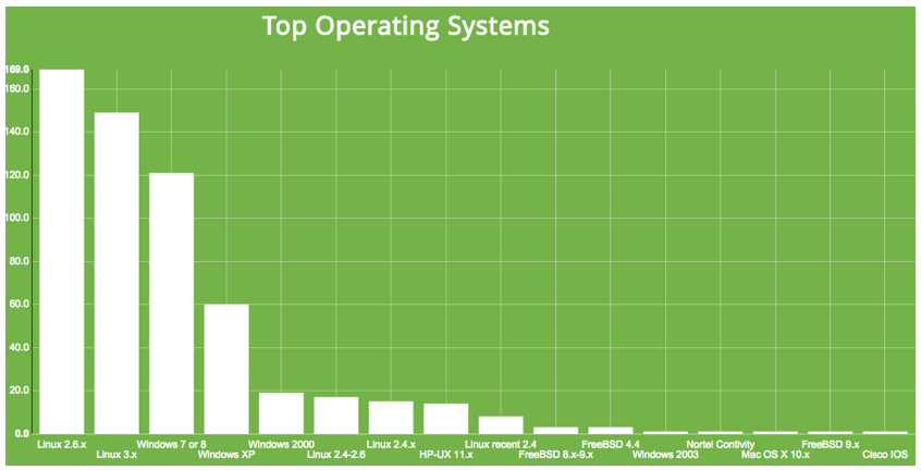
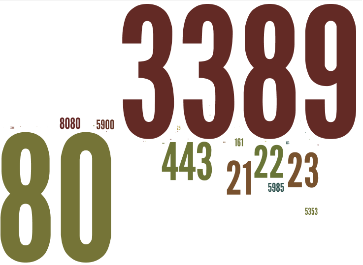
Top 10 most frequently occurring words/tokens — no big surprises — lots of web stuff

I’ll eyeball those and then write those to a stoplist so that they don’t occur in the next run. Then I’ll look at the next 10 most frequently occurring. After doing that a few times, I’ll dig deeper, taking bigger chunks, and ask for the 100 most frequently occurring. And then maybe the next 1000 most frequently occurring.

This is the excavation part, gradually skimming the most frequently occurring off the top to see what’s ‘underneath’. Some of the results are surprising.

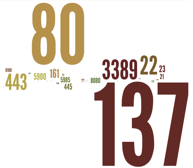
‘Password’ frequency in top 0.02% of banner words

Just glancing at the top 10, not much is surprising — a lot of web header stuff. Taking a look at the top 100 most frequently occurring banner tokens, we see more web stuff, NetBIOS revealing itself, some days of the week and months, and other. We also see our first example of third party web interface software with Virata-EmWeb. (Third party web interface software is interesting because a vulnerability here can cross into multiple different types of devices and systems.) Slicing off another layer and going deeper by 100, we find the token ‘Password’ at approximately the 250th most frequently occurring point. Since I’m going through 1.5 million words (tokens), that means that ‘Password’ frequency is in the top 0.02% or so of all tokens. That’s sort of interesting.

But as I dig deeper, say the top 1500 or so, I start to see Lantronix, a networked device controller, showing up. I see another third party web interface, GoAhead-Webs. Blackboard often indicates Point-of-Sale devices such as card swipers on vending machines. So even looking at only the top 0.1% of the tokens, some interesting things are showing up.

LantronixGoAheadBB

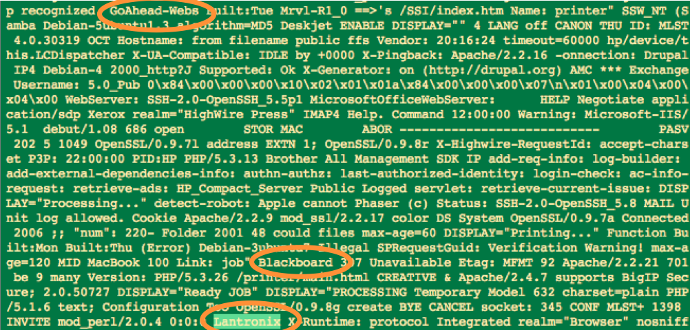
Digging deeper — Even in the top 0.1% of tokens, interesting things start to show up

New devices & systems showing up

But what about the newer, less frequently occurring, banner words (tokens) showing up in the list? Excavating like this can clearly get tedious, so what’s another approach for discovery of interesting, diagnostic, maybe slightly alarming words in banners on our networks? In a subsequent post, I’ll explain my next approach that I’ve named ‘cerealboxing’, based on an observation and concept of Steve Ocepek’s regarding our human tendency to automatically read, analyze, and/or ingest information in our environment, even if passively.

Borrowing from search to characterize network risk

Most frequently occurring port is in outer ring, 2nd most is next ring in, ...

Most frequently occurring port is in outer ring, 2nd most is next ring in, …

Borrowing some ideas from document search techniques, data from the Shodan database can be used to characterize networks at a glance. In the last post, I used Shodan data for public IP spaces associated with different organizations and Wordle to create a quick and dirty word cloud visualization of exposure by port/service for that organization.

The word cloud idea works pretty well in communicating at a glance the top two or three ports/services most frequently seen for a given area of study (IP space).  I wanted to extend this a bit and compare organizations by a linear rank of the most frequently occurring services seen on that organization’s network.  So I wanted to capture both the most frequently occurring ports/services as well as the rank amongst those and then use those criteria to potentially compare different organizations (IP spaces).

Vector space model

I also wanted to experiment with visualizing this in a way that would give at a glance something of a ‘signature’.  Sooooo, here’s the idea: document search often uses this idea of a vector space model where documents are broken down into vectors.  The vector is a list of words representing all of the words that occur in that document.  The weight given to each word (or term or element) in the vector can be computed in a number of different ways, but one of the most popular is frequency with which that word occurs in that document (and sometimes with which it occurs in all of the documents combined).

A similar idea was used here, except that I used frequency with which ports/services appeared in an organization instead of words in a document. I looked at the top 5 ports/services that appeared.  I also experimented with the top 10 ports/services, but that got a little busy on the graphic and it also seemed that as I moved further down the ordered port list — 8th most frequent, 9th most frequent, etc — that these additional ports were adding less and less to the characterization of the network. Could be wrong, but it just seemed that way at the time.

I went through 12 organizations and collected the top 5 ports/services in each. Organizations varied between approximately 10,000 and 50,000 IP addresses. To have a basis for comparison of each organization, I used a list created by the ports returned from all of the organizations’ Top 5 ports.

Visualizing port rank ‘signatures’

A polar plot was created where each radial represents each port/service.  The rings of the plot represent the rank of that port — most frequently occurring, 2nd most frequently occurring, …, 5th most frequently occurring. I used a polar plot because I wanted something that might generate easily recognizable shapes or patterns. Another plot could have been used, but this one grabbed my eye the most.

Finally, to really get geeky, to measure similarity in some form, I computed the Euclidean distance between each possible vector pair. Two of the closest organizations of the 12 analyzed are (that is most similar port vectors):


mostsimilar

2 of the most similar organizations by Euclidean distance — ports 21, 23, & 443 show up with the same rank & port 80 shows up with a rank difference of only 1. This makes them close.  (Euclidean distance of ~2.5)

Two of the furthest way of the 12 studied are these (least similar port vectors):


leastsimilar

While port 80 aligns between the two (has the same rank) and port 22 is close in rank between the two, there is no alignment between ports 23, 3389, or 5900. This non-alignment, non-similar port rank, creates more distance between the two. (Euclidean distance of ~9.8)

Finally, this last one is some where in the middle (mean) of the pack:


midsimilar

A distance chosen from the middle of the sorted distance (mean). Euclidean distance is ~8.7. Because this median value is much closer to the most dissimilar, it seems to indicate a high degree of dissimilarity across the set studied (I think).

Overall, I liked the plots. I also liked the polar approach. I was hoping that I would see a little more of a ‘shape feel’, but I only studied 12 organizations.  I’d like to add more organizations to the study and see if additional patterns emerge. I also tried other distance measuring methods (Hamming, cosine, jaccard, Chebyshev, cityblock, etc) because they were readily available and easy to use with the scipy library that I was using, but none offered a noticeable uptick in utility over the plain Euclidean measure.

Cool questions from this to pursue might be:

1. For similar patterns between 2 or more organizations, can history of network development be inferred? Was a key person at both organizations at some point? Did one org copy another org?

2. Could the ranked port exposure lend itself to approximating risk for combined/multiprong cyber attack?

Again, if you’re doing similar work on network/IP space characterization and want to share, please contact me at ChuckBenson at this website’s domain for email.

Poor Man’s Industrial Control System Risk Visualization

The market is exploding with a variety of visualization tools to assist with ‘big data’ analysis in general and security and risk awareness analysis efforts in particular. Who the winner is or winners are in this arena is far from settled and it can be difficult to figure out where to start. While we analyze these different products and services and try some of our own approaches, it is good to keep in mind that there can also be some simple initial value-add in working with quick and easy, nontraditional (at least in this context), visualization

Even simple data visualization can be helpful

I’ve been working with some Shodan data for the past year or so. Shodan, created by John Matherly, is a service that scans several ports/services related to Industrial Control Systems (ICS) and, increasingly, Internet of Things sorts of devices and systems. The service records the results of these scans and puts them in a web accessible database. The results are available online or via a variety of export formats to include csv, json, and xml (though xml is deprecated). In his new site format, Matherly also makes some visualizations of his own available. For example, here’s one depicting ranked services for a particular subset of IP ranges that I was analyzing:

Builtin Shodan visualization -- Top operating systems in scan

One of the builtin Shodan visualizations — Top operating systems

Initially, I wanted to do some work with the text in the banners that Shodan returns, but I found that there was some even simpler stuff that I could do with port counts (number of times a particular port shows up in a subset of IP addresses) to start. For example, I downloaded the results from a Shodan scan, counted the occurrences for each port, ran a quick script to create a file of repeated ‘words’ (actually port numbers), and then dropped that into a text box on Wordle.

Inexpensive (free) data visualization tools

Wordle is probably the most popular web-based way of creating a word cloud. You just paste your text in here (repeated ports in our case):

Just cut & paste ports

Just cut & paste ports into Wordle

Click create and you’ve got a word cloud based on the number of ports/services in your IP range of interest. Sure you could look at this in a tabular report, but to me, there’s something about this that facilitates increased reflection regarding the exposure of the IP space that I am interested in analyzing.


org3portwordle

VNC much? Who says telnet is out of style ?

[For some technical trivia, I did this by downloading the Shodan results into a json file, used python to import, parse, and upload to a MySQL database, and then ran queries from there. Also, Wordle uses Java so it didn’t play well with Chrome and I switched to Safari for Wordle.]

In addition to quickly eyeball-analyzing an IP space of interest, it can also make for interesting comparisons between related IP spaces. Below are two word clouds for organizations that have very similar missions and staff make up. You would, I did anyway, expect their relative ports counts and word clouds to be fairly similar. As the results below show, however, they may be very different.

org1portwordle

Organization 1’s most frequently found ports/services

org2portwordle

Organization 2’s most frequent ports/services — same mission and similar staffing as Org 1, but network (IP space) has some significant differences

Next steps are to explore a couple of other visualization ideas of using port counts to characterize IP spaces and then back to the banner text analysis. Hopefully, I’ll have a post on that up soon.

If you’re doing related work, I would be interested in hearing about what you’re exploring.