There are many different estimates regarding the growth rate of the Internet of Things (IoT). There are projections of number of connected devices, projections on market capitalization, projections on growth of semiconductor counts supporting those devices, and many others. Because the numbers of devices and systems are so high and these projections are around things that we typically don’t understand well, it’s hard to get a feel for what is actually increasing so rapidly. What is this thing that is growing so rapidly? How fast is it growing? If we can’t roughly understand the magnitudes involved, we can’t discuss, plan, assess, or begin to mitigate risk to our organizations and institutions involving these systems.
Going old school

Summa de arithmetica – Wikipedia http://bit.ly/1MHOuxO
One way to better our ballpark understanding of this rate of growth can be with the old school method of applying the Rule of 72. Introduced by Pacioli in Summa de Arithmetica, the Rule of 72 has been around for over half of a millennium as a mental mechanism to quickly estimate how long it takes a value experiencing exponential growth to double. This works with systems that have parameters that are described by a percentage change over a period of time. The classic example is interest on a loan or investment that compounds. Because we are used to seeing these kinds of measures in financial, economic, and political systems, we will see them in IoT conversations also.
To apply the Rule of 72, you take the rate of growth for a period expressed as a percentage and then divide that into the number 72. The result is the number of time periods, typically expressed in years, that it takes for the doubling to occur.
For example, if you buy a house that increases in value by 6% per year, the time to double the value is:
72 / 6 = 12
or 12 years to double. So a $400,000 house purchased today that appreciates by 6% per year will see a value of around $800,000 in 12 years.
(72 is a convenient estimate that facilitates mental division with values such as 2, 3, 4, 6, 8, 12, etc. A more accurate, but less easy to mentally work with, value is closer to 69. This stems from the value for natural log 2, aka ln(2), which is .69314 … For our purposes, we’ll stick with 72.)
Making IoT growth estimates more understandable
As we all try to get our heads around IoT, what it is, and how fast it is growing, we are bombarded by a variety of estimates and figures. We know these numbers seem big, but we’re not really sure how to use these figures or compare them to something else. Being able to quickly compute how long it takes for something to double in quantity can have more meaning for us than trying to interpret growth expressed as a percentage.
In his book Grapes of Math, Alex Bellos does a great job of describing where the Rule of 72 comes from and how it works. Further he reminds us that economic, financial, political, and other growth measures that describe sales, profits, stock prices, GDP, population, inflation, and more are often stated in percentage growth per year. Because of our familiarity with communicating this way, we can expect at least some IoT growth projections to be stated this way as well.
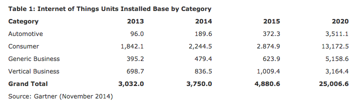
Gartner Press Release http://www.gartner.com/newsroom/id/2905717
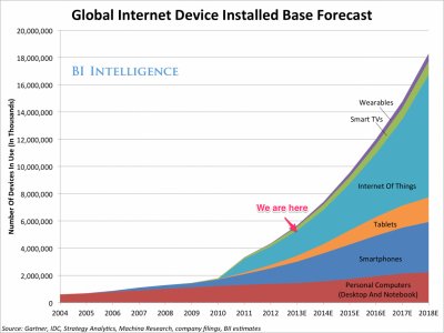
Gartner’s installed IoT base estimate from late 2014 suggests exponential growth — 25% growth from 2013 to 2014, 30% growth from 2014 to 2015, and what looks like almost 40% annual growth from 2015 to 2020. If this is the case, then we can estimate 72 / 40 = 1.8 years to double. So, if we started with the almost 5 billion devices indicated in the 2015 column, we’d have 10 billion in about 22 months, sometime in 2017 — 1.8 x 12 months.
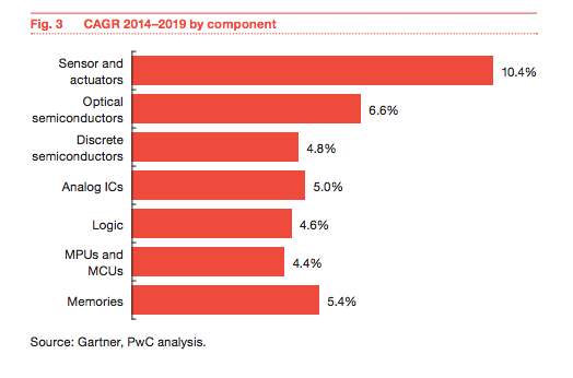
Analysis of IoT growth on semiconductor industry – http://pwc.to/1kwDuNc
This Gartner/PriceWaterhouseCoopers analysis shows a CAGR growth for sensors and actuators of approximately 10%. Applying the Rule of 72 for an estimate, we can expect to see the number of sensors and actuators deployed in the world around us to double in ~72 / 10 = 7.2 years — less than 2 presidential terms. What will twice the number of sensors and actuators around us look like?
According to this IDC report, the IoT market will see 19% growth for a market size doubling in a little under 4 years (72/19 = 3.8). The biggest growth area was 40% CAGR in the automotive sector for a market doubling in under 2 years.
Lots more connections … http://bit.ly/1msfrjG
This Business Insider report suggests a 45% year over year growth from 2 billion in 2014 to 9 billion in 2018 for connection count doubling in 72/45 = 1.6, a little over a year and a half.
And finally, ON World predicts a 250% growth in wireless light bulbs for a doubling in every ~ 3.5 months.
Limitations
It’s important to note that we don’t know what IoT growth will actually look like over several years. We have some initial data from the first few years that seem to suggest that this growth will be exponential versus linear growth, for example. Also where the Rule of 72 was initially applied — money growth (compounding) — is a recursive context — money grows because there is money to act on (and time). IoT growth will come from something else. At least for now, it’s not obvious that IoT growth is or will be recursive* — we don’t know that many IoT deployments this year will cause even more deployments next year, and then that next year’s increased deployments will cause yet an even higher incremental increase the following year, and so on.
*[One frightening possibility, of course, is the Skynet scenario from Terminator where conscious machines build conscious machines and recursion in full play …]
If, however, IoT growth roughly mimics or correlates to compounding growth (for whatever reason), then we can use the Rule of 72 to help us quickly estimate magnitudes and time scales and add some context to our conversations. With more context around the phenomenon of IoT, the better are our chances for managing the risk to our organizations that comes from its proliferation.