
Visualization is a powerful tool for simple information risk analysis. The simple of act of placing risks in spacial relationship to each other allows a quick overview of essential elements of your risk profile. As importantly, it allows you to communicate that simple risk profile to others that aren’t as versed in information security, IT, and information management. A popular risk visualization tool is an information risk heat map.
A couple of posts ago, I talked about creating a simple risk register. In a nutshell, this is a list of things that can go wrong in the IT and information management part of your business with an estimate of how bad it would be and how likely you think it is to happen. An example might be as simple as, “business shutdown for greater than 3 days because no backup for critical data — medium probability, high impact” or “data inaccessibility because of failure of cloud services provider — medium probability, medium impact.”
As a reminder, keep your analysis simple for probability and impact of event. I suggest just Low, Medium, or High to start. As a small or medium-sized company, you probably don’t have a lot of data to drive estimates for probability, so just make your best educated estimate. For example, if I’ve got a server with a RAID 5 configuration, I think the chances of 2 disks failing simultaneously (resulting in data loss) is Low. Similarly, for impact, keep the analysis of impact pretty simple to start. For example, amount of time offline might be a guideline for you — maybe 4 hours or less offline is Low impact for you, 4 hours to 2 days is Medium, and greater than 2 days is High. How you define impact is a statement of your business’s “risk tolerance” and will vary from business to business. The main thing to remember is to not make it overly complicated.
The heat map is going to be a simple 3 x 3 grid with probability on one axis and impact on the other. The cells inside the grid will contain the actual risks.
In the original risk register example, there were four columns: risk description, probability, impact, and then a column for date added. To create the heat map, we’re going to add one more column to the far left simply called Risk #. This is just a number to identify the risk. It doesn’t indicate any sort of risk priority.
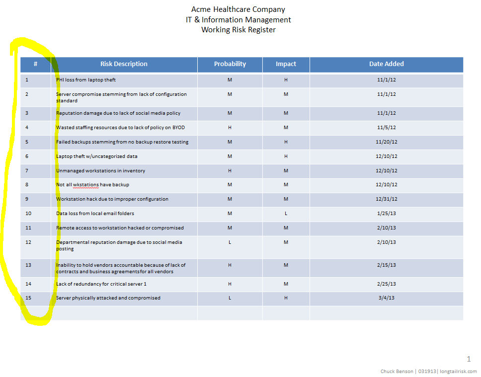
information risk register with numeric indices
Once you have the risk register that includes the Risk # column (which is just an index to the risk description and not a priority), start your heat map by creating a 3 x 3 grid with probability of the event happening on one axis and impact of the event of the other axis.
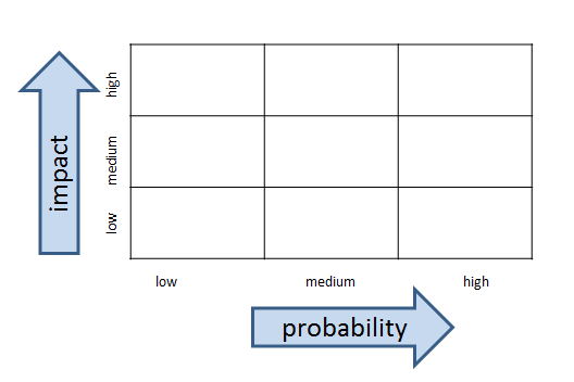
basic information risk management heat map grid
If you’d like add some color:

information risk management heat map grid with color
Finally, add the risk index #’s from your risk register
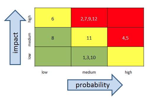
information risk management heat map grid with risk indices
Once people orient to axes on the heat map, their eyeballs generally go directly to the upper right hand corner of the heat map where the higher impact and probability events are. This is not a bad thing.
With your simple heat map, and without a lot of work, you now have some insight into your operation’s risk profile and are in a better position to make informed business decisions.
Have you created information risk registers or information risk heat maps before? What did you use for criteria for impact?